Every year, the Color of the Year selections from major paint brands inspire homeowners to update their interiors with fresh, modern charm. For 2025, these color choices span a broad palette that blends timeless elegance with deep bold palettes and versatile hues. Whether you’re aiming for a rustic chic ambiance or modern minimalism, there’s a perfect hue to fit every style. This guide dives into the top paint colors, offering ideas for how to use them in your space for a look that’s both on-trend and enduring.
Benjamin Moore – Cinnamon Slate: The Warm Embrace of Velvety Brown
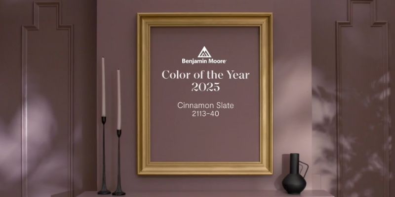
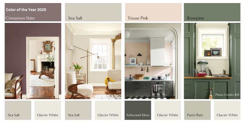
Benjamin Moore’s Color of the Year, Cinnamon Slate 2113-40, is a classic shade that exudes a modern sensibility. This delightful neutral hue combines heathered plum with velvety brown, making it an ideal choice for those looking to add depth and sophistication to personal spaces. Benjamin Moore’s color marketing manager describes Cinnamon Slate as a “versatile shade” that layers beautifully with other soft neutral hues, adding warmth to any indoor environment. Whether used as an accent wall or in an all-over scheme, Cinnamon Slate offers homeowners a flexible option to create spaces that feel both cozy and chic.
Cinnamon Slate has quickly become a favorite in color marketing, resonating with homeowners looking to incorporate timeless colors into their living rooms, dining rooms, and other gathering spaces. It works well with complementary colors like soft sage, adding a striking contrast when paired with bolder colors. This rich hue embodies the idea of self-expression and is a fantastic choice for those who want a modern color drench effect without overwhelming the room.
HGTV Home by Sherwin Williams – Quietude: A Soft Sage for Serene Moments

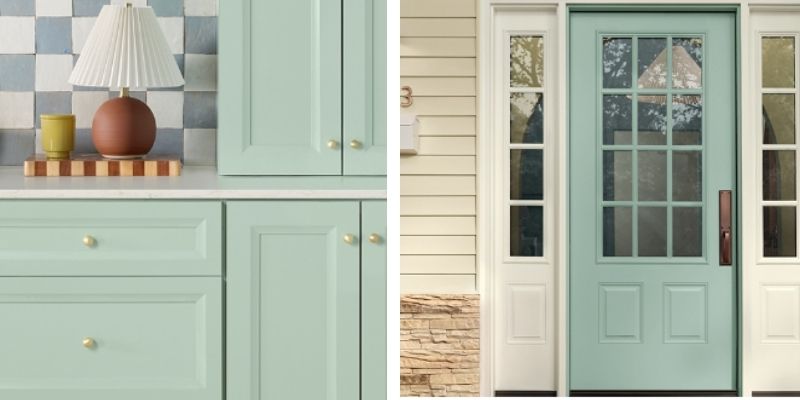
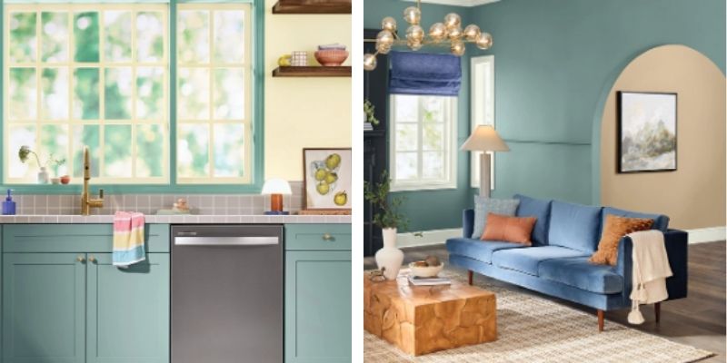
HGTV Home by Sherwin Williams selected Quietude as their 2025 Color of the Year, a soft sage that brings tranquility and calm to interior spaces. This delicate mix of green and blue undertones adds serenity to the home, making it perfect for those who want to create personal spaces that offer a break from the high-tech age. Sherwin Williams’ color marketing manager describes Quietude as a chameleon color that complements a broad range of design aesthetics, from cozy traditional settings to modern minimalism.
With its soothing hue, Quietude can be used to add depth to any room, creating a welcoming atmosphere ideal for bedrooms, living rooms, and bathrooms. Quietude is an excellent choice for those seeking a balance between modern charm and enduring design, enhancing interior walls with a soft, subtle presence that allows for self-expression.
Valspar – Encore: A Jewel-Toned Blue for Timeless Elegance
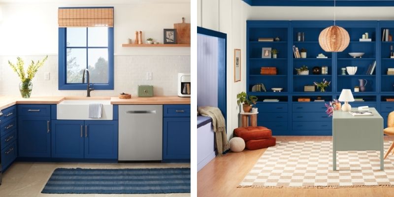
Valspar has chosen Encore as its 2025 Color of the Year, bringing a deep jewel-toned blue influence into the spotlight. This color embodies mysterious beauty and timeless elegance, offering homeowners the perfect hue for adding drama to their space. Encore’s blue influence works exceptionally well on accent walls, creating a striking contrast against soft neutrals or in spaces where a touch of luxury is desired.
Valspar’s color marketing team sees Encore as ideal for living rooms, dining rooms, and other personal spaces, adding both depth and sophistication. Encore is a chameleon color that adapts well to various design styles, from bold modern aesthetics to serene, classic settings, giving every room a touch of mysterious allure.
Glidden – Purple Basil: Bold Jewel Tones for a Striking Look
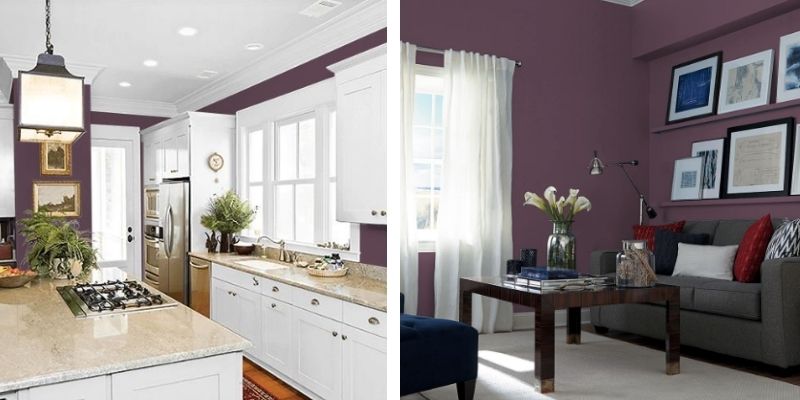
Glidden’s Color of the Year, Purple Basil, stands out with its deep, jewel-toned vibrance. This rich hue is a popular choice for homeowners seeking to make a statement. Purple Basil offers a dramatic pop of color that pairs beautifully with muted tones, creating an eye-catching contrast that can elevate any room. Glidden’s color marketing manager highlights Purple Basil as a versatile option for accent walls, interior walls, or even statement pieces like furniture.
Ideal for both traditional and modern settings, Purple Basil allows for self-expression and adds a layer of textured allure to personal spaces. This color can add drama to dining rooms or living rooms, creating a luxurious atmosphere that resonates with the trend specialist’s view of sophisticated self-discovery.
Dunn-Edwards – Caramelized: A Warm, Inviting Neutral
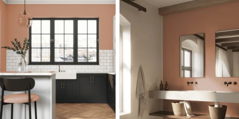
Dunn-Edwards’ Color of the Year, Caramelized, is inspired by desert landscapes, offering a soft, warm brown that creates a rustic chic ambiance. This delightful neutral hue works well in any room, inviting warmth and a cozy vibe that pairs beautifully with both neutral and darker colors. Dunn-Edwards highlights Caramelized as a chameleon color that can add depth to spaces, embodying a sense of quiet yet vibrant beauty.
For homeowners drawn to earthy tones, Caramelized offers a subtle way to bring the outdoors in, making it perfect for a wide range of design aesthetics. This versatile shade enhances personal spaces, balancing well with modern charm and providing the perfect canvas for self-expression.
Dutch Boy – Mapped Blue: Classic, Calming Blue for Modern Sensibility
Dutch Boy introduces Mapped Blue, a classic shade that brings a serene, calming influence to indoor environments. This soft, versatile blue adds timeless elegance and complements various complementary colors, from muted neutrals to vibrant accents. Dutch Boy’s color marketing manager describes Mapped Blue as perfect for spaces where serenity and sophistication are desired, enhancing both cozy and high-tech age interiors.
Mapped Blue’s calm presence makes it ideal for bedrooms, bathrooms, and even living rooms, creating a harmonious balance in spaces designed for relaxation. As a modern sensibility staple, this color layers beautifully with various styles, whether used as an accent wall or all-over scheme.
Conclusion:
Embrace 2025’s Colors of the Year for a Personalized, Timeless Look
The 2025 Color of the Year picks offer homeowners endless possibilities to create personal spaces that reflect self-discovery, creativity, and modern sensibility. Whether it’s the rustic chic warmth of Cinnamon Slate, the jewel-toned drama of Purple Basil, or the serene influence of Quietude, there’s a color palette to suit every style. Paint colors like Encore, Caramelized, and Mapped Blue provide complementary colors for every room, making it easy to add drama or create serene moments.
From sherwin williams to benjamin moore, each brand’s color marketing manager envisions these colors not only as indoor environment enhancers but as tools for homeowners to transform spaces. The versatility of paint colors this year encourages both bolder colors and subtle palettes, allowing you to add depth and timeless elegance with ease. Embrace the 2025 Color of the Year trends, and discover how these beautiful hues can help you create personal spaces filled with timeless colors and enduring charm.
Now is the perfect time to call Trico Painting to discuss your interior painting project. With the vibrant and versatile trends of 2025’s Colors of the Year, your home can truly reflect your personal style and aspirations. Whether you’re looking to introduce a touch of serene blue, embrace the warmth of earthy tones, or make a bold statement with jewel hues, Trico Painting’s expert team is ready to guide you through the transformation. Don’t miss the opportunity to enhance your space with timeless elegance and creativity. Contact Trico Painting today to start turning your vision into reality.

