
Best 2026 Paint Colors for Your Home
Choosing the perfect paint color feels overwhelming. But in 2026, the major brands—Benjamin Moore, Sherwin-Williams, BEHR, PPG, Dunn-Edwards, and more—are leaning toward nature, warmth, and timeless neutrals. In this post, we break down the top color trends of 2026, the psychology behind them, and how Trico Painting stays ahead so your home feels modern yet comfortable.
The 2026 Headline: Comfort, Calm, and Quiet Luxury
Across major manufacturers, 2026 pivots toward nature-rooted, warm, and enduring hues—colors that feel restorative but still sophisticated. Think grounded khakis, smoky jade blue-greens, deep garden greens, and burnished mahogany browns. These tones pair beautifully with natural wood, stone, and matte metals and look great in Northern California’s golden light.
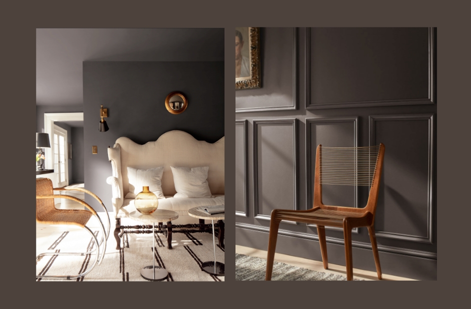
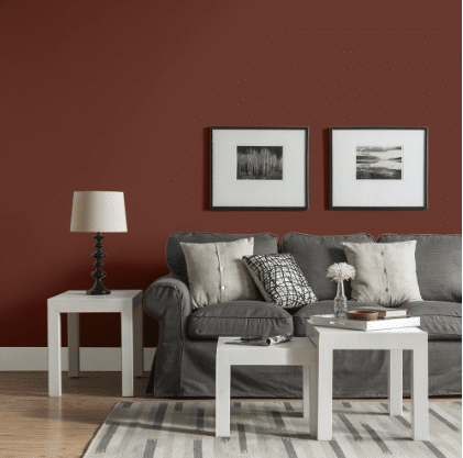
Benjamin Moore — Silhouette (AF-655)
Mood: Sophisticated, moody, and effortlessly elegant.
Best uses: Accent walls in living or dining rooms; cozy bedrooms seeking drama and warmth; paired with soft neutrals for a high-contrast modern look.
Pairs with: Creamy taupes, warm whites, aged brass, velvety plum, and natural wood tones.
Credit Benjamin Moore
Benjamin Moore’s Silhouette AF-655 exudes modern sophistication — a moody blend of charcoal, plum, and soft brown that captures both warmth and depth. This luxurious hue creates an atmosphere of quiet confidence, perfect for homeowners seeking elegance with a contemporary edge. Silhouette’s velvety richness pairs beautifully with creamy whites, warm taupes, brass accents, and natural wood tones, making it ideal for accent walls, cozy bedrooms, or dramatic dining spaces. In California homes, it offers a refined sense of comfort — grounding interiors with style and grace while complementing the soft, golden light of the West Coast.
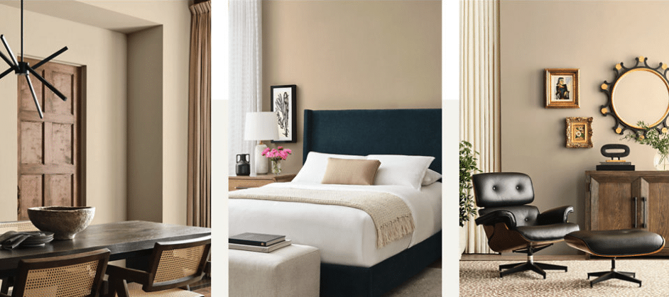
Sherwin-Williams — Universal Khaki (SW 6150)
Mood: Warm, quietly luxurious, adaptable.
Best uses: Whole-home walls for cohesive flow; living rooms that need warmth; kitchen walls with white or natural-wood cabinets.
Pairs with: Creamy whites, olive/forest accents, oxidized bronze, woven textures
Credit Sherwin Williams
Sherwin-Williams’ Universal Khaki is the definition of quiet luxury—an adaptable warm neutral that feels timeless yet modern. With a balance of beige and gray undertones, it pairs effortlessly with creamy trim, bronze hardware, and natural oak accents. This calming shade brings an understated sophistication to any California home, grounding open-concept spaces and unifying rooms with soft continuity. Its versatility makes it perfect for walls, cabinetry, or exteriors where homeowners want warmth without overwhelming color.
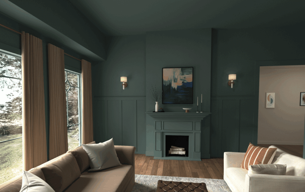
Dunn-Edwards — Midnight Garden (DE5657)
Mood: Deep garden calm; cocooning and refined.
Best uses: Bedrooms, libraries, dining rooms, and north-facing rooms where a deeper hue feels intimate. Also stunning for front doors and exteriors with stone or warm stucco.
Pairs with: Textured linens, walnut/oak, unlacquered brass, off-white trim.
Credit Dunn Edwards
Midnight Garden from Dunn-Edwards embodies the desire for peace and retreat in modern living. This deep mossy green creates a cocooning atmosphere reminiscent of tranquil forests and moody California evenings. Ideal for bedrooms, studies, or exteriors, it transforms any space into a sanctuary. The color’s psychological pull toward restoration and focus makes it especially appealing to homeowners seeking a calm, confident palette that connects the indoors with the serenity of nature.
BEHR — Hidden Gem
Mood: Smoky jade “new neutral”—serene but sophisticated.
Best uses: Built-in cabinetry, office accent walls, mudrooms, and pantries; also beautiful for color-drenching small spaces.
Pairs with: Natural oak, black hardware, limestone, soft gray upholstery.
Credit BEHR
BEHR’s Hidden Gem is a smoky blue-green that redefines what a “neutral” can be. Inspired by ocean mists and eucalyptus groves, it evokes serenity, depth, and confidence. This hue works beautifully in bedrooms, offices, and dining spaces—anywhere you want a sense of balance and calm. It complements both cool and warm materials, from quartz counters to brushed-brass fixtures, making it a stunning choice for homeowners looking to add color that still feels natural and sophisticated.
PPG — Warm Mahogany (PPG1060-7)
Mood: Grounded, burnished, tailored.
Best uses: Entryways, powder baths, libraries, paneled walls, kitchen islands, and tongue-and-groove ceilings.
Pairs with: Creams, warm whites, aged brass, cognac leather, charcoal stone.
Credit PPG – Glidden
PPG’s Warm Mahogany delivers rich character and cozy refinement. This brown-red tone channels mid-century design and handcrafted finishes, bringing depth and elegance to living spaces. It’s ideal for accent walls, front doors, and built-ins where homeowners want to make a statement without straying from an earthy palette. The color’s subtle red undertones add emotional warmth, making rooms feel grounded, welcoming, and quietly luxurious—a perfect match for today’s return to natural materials and heritage craftsmanship.
Why Trends Are Leaning Warm + Nature-Linked (The Psychology)
-
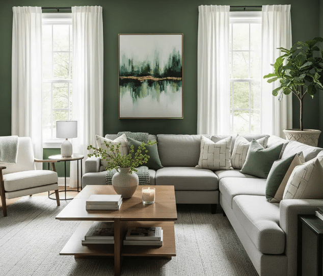
Greens = Restoration & Balance. Biophilic colors reduce visual “noise,” making spaces feel calmer and more focused—perfect for bedrooms, studies, and kitchens where families gather. Midnight Garden and Hidden Gem reflect that desire for sanctuary and serenity.
-
Warm Neutrals = Stability & Longevity. After years of cool grays, homeowners are choosing mid-tone khakis and beiges that read timeless, cozy, and versatile—supporting durable, long-term design plans. Universal Khaki is positioned as exactly that: essential, balanced, and calm.
-
Rich Browns = Heritage & Comfort. Brown-reds convey groundedness and tactility (leather, wood, clay). Warm Mahogany adds sophistication without harshness, working as a softer alternative to black.
Regional Fit: Roseville, Granite Bay, Rocklin, Folsom, Loomis & Surrounding Areas
In the greater Roseville region, our abundant California sunlight leans warm and golden, enhancing the depth of mid-tone neutrals and natural greens throughout the day. Exterior palettes featuring khaki or warm beige walls paired with deep green shutters or doors look stunning against terra-cotta roofs, stone accents, and drought-tolerant landscaping common to our area. Indoors, homeowners can achieve effortless sophistication with rich mahogany millwork or smoky jade cabinetry, beautifully balanced by light countertops and warm wood flooring. These colors reflect the relaxed elegance and natural warmth that define Northern California living.
Sample Palettes You Can Try
-
California Quiet Luxury (Whole-Home): Universal Khaki walls, creamy trim, oiled bronze hardware, oak accents.
-
Sanctuary Study: Midnight Garden on walls/trim/ceiling (color drench), natural linen drapes, unlacquered brass lamp.
-
Modern Craftsman Kitchen: Hidden Gem island, warm white perimeter cabinets, matte black pulls, honed limestone.
-
Tailored Entry: Warm Mahogany front door, khaki siding, limestone porch, aged brass lanterns.
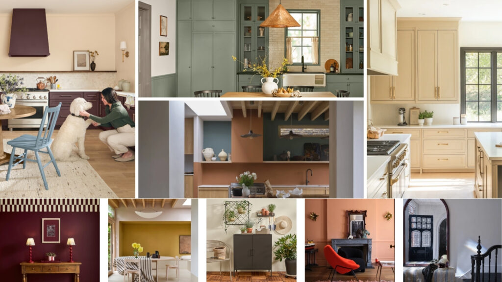
And That’s Not All — More 2026 Colors Turning Heads
Beyond the colors we’ve already highlighted, a few other shades are making waves in 2026. Many brands are embracing grounded comfort and warm neutrals, with Dutch Boy’s Melodious Ivory, Minwax’s Special Walnut, and C2 Paint’s Epernay all celebrating warmth, texture, and timeless appeal. The nature-inspired green movement continues with Valspar’s Warm Eucalyptus and WGSN + Coloro’s Transformative Teal—both calm, restorative tones that reflect our collective pull toward the outdoors. And for homeowners craving something moodier, deep, expressive hues like Glidden’s Warm Mahogany, Krylon’s Coffee Bean, and Graham & Brown’s Divine Damson prove that 2026 isn’t afraid of a little drama or luxury.
How TRICO PAINTING Helps You Nail the Choice
At TRICO PAINTING, we live and breathe color theory and current trends. We don’t just follow the news—we test undertones in your light, on your surfaces, with your finishes. Our process includes:
-
Expert guidance on undertones and LRV (so colors don’t surprise you at 3 p.m.)
-
Finish recommendations (matte/eggshell/satin) based on durability and sheen behavior
-
Cohesive whole-home palettes that look intentional—not just trendy
Ready to see these 2026 colors in your home?
Schedule your free color consultation today and let our experts bring warmth and sophistication to your space.
Schedule Now!